TIPS FOR A SUCCESSFUL PROMOTIONAL SIGN – DESIGN COLOR
Henry Ford once said you can have a Model T in “any color as long as it is black.” Going off of that, a survey conducted by the University of Florida claimed that a yellow background with black lettering was the optimal color combination for a sign to attract attention. To top it off, the packaging industry says that the color red is the favored attention-getting color down supermarket aisles. There you have it! Even industry experts agree to disagree.
What’s the best color choice for your promotional, custom sign? Take your pick as to what suits your event or business. That’s your answer! Here are some helpful design color tips that will help guide your sign design:
Consider Color Value
Never use a low-value color (light color) with a low-value color. For example on design color tips, light yellow lettering on a white background will not show up. All pastels (e.g. pale blue, yellow, pink, light green) will not contrast against white backgrounds. Fluorescents, though appearing very bright, will not contrast on white. Choose a dark (high value) color (e.g. black, navy blue, burgundy, red, forest green).
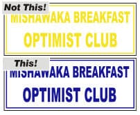
Similarly, never use a high-value color with a high-value color. For example, black lettering on a navy blue background will not show.
Lettering and background must always have contrasting values for purposes of readability.
Consider Environment
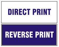
It’s important to remember that white is considered a base stock color and FREE of charge. Colored lettering (blue, red, green, orange, etc.) on a white background is a one-color print. The same holds true for white lettering on a blue background. The blue is printed in reverse.
Avoid white custom signs in winter, especially Northerners. To not have your sign “lost” against the snow, use reverse printing (i.e. bright-colored printed background with white letters). Similarly, green backgrounds can get lost in more lush territories and/or seasons, as yellow signs can against arid backgrounds. Keep your sign easily recognizable by choosing a color that is “out of place” in the environment that the sign is located. Try to avoid khaki, grey, or brown background colors for that reason. For standard ink colors, consult our ink colors gallery.
Two Colors vs. One Color
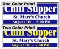
Improve one color designs by adding a second color. Remember white, as a base stock color, is free. Two-color printing will always stand out with greater impact. Try a yellow and black sign; a red, white, and blue sign; or a light green and navy sign!
As for the printer, two colors require two films, two screens, two setups, two runs, and two cleanups – all of which equate to the overall cost of the custom sign. Expect to pay more for a two-color sign, as they are not considered a cheap yard sign. However, a two-color sign may fit your needs!
PromoteSigns hopes these suggestions will aid in your color decisions for promotional products and signs. For a wide range of ideas, it is helpful to consult galleries on a screen printer’s website. If you have questions, do not hesitate to consult directly with your screen printer – they have the expertise to help.